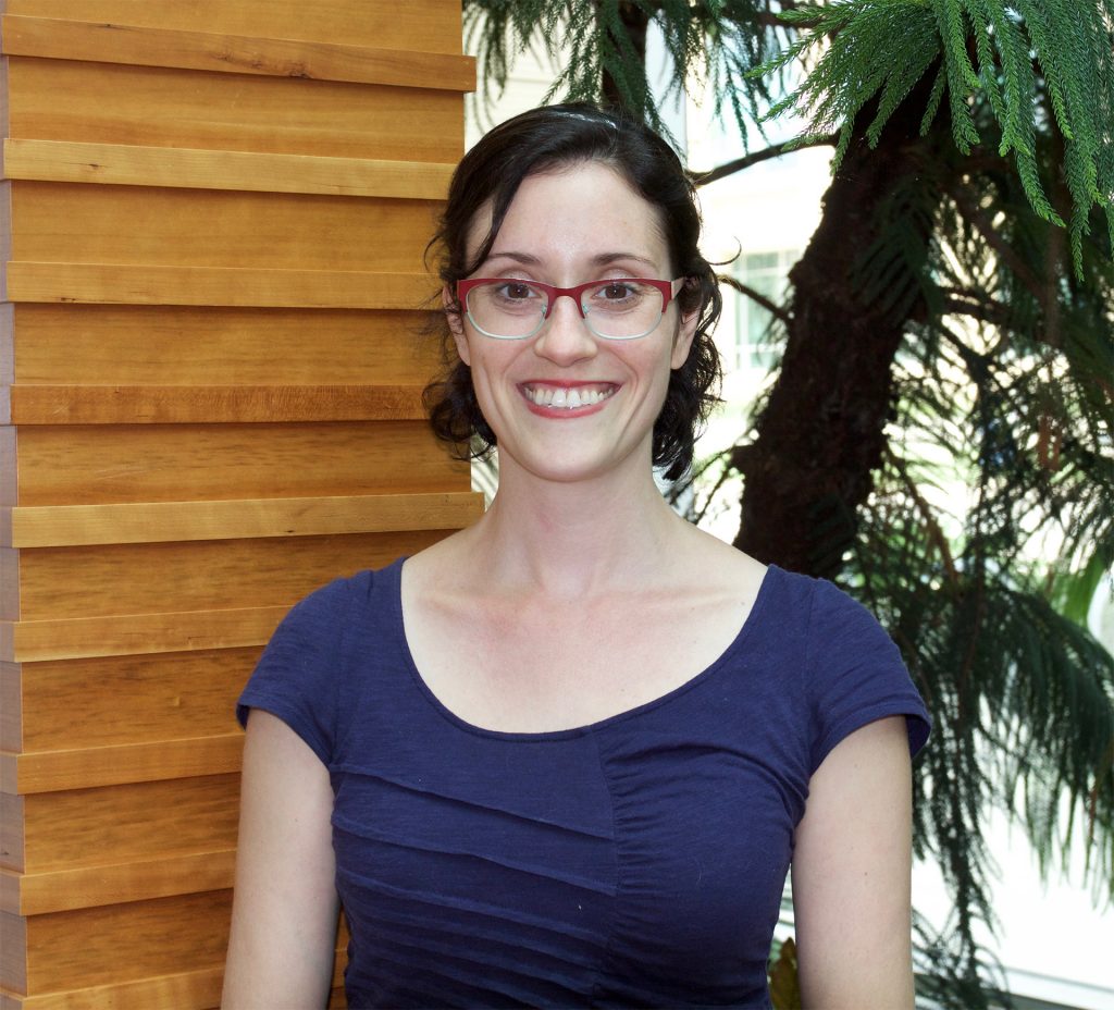
Karen Schloss
Biographie

Karen Schloss is an Assistant Professor at the University of Wisconsin – Madison in the Department of Psychology and Wisconsin Institute for Discovery – Living Environments Lab. She received her BA from Barnard College, Columbia University in 2005, with a major in Psychology and a minor in Architecture. She then conducted her graduate studies with Stephen Palmer at the University of California, Berkeley, where she received her PhD in Psychology in 2011. She continued working with Stephen Palmer as a postdoctoral scholar from 2011-2013. In 2013, Karen became an Assistant Professor of Research at Brown University in the Department of Cognitive, Linguistic, and Psychological Sciences.
At Brown, she formed her
Visual Perception and Cognition Lab, which investigates how colors influence the way people think, feel, and behave. Her research focuses on what determines people's aesthetic preferences for colors, how those preferences influence decision making, and how colors can be used to communicate meaning in information visualizations. Karen recently moved her lab to the University of Wisconsin – Madison (Summer 2016), where she will extend her research to understand how colors influence judgments and behavior in immersive virtual environments.
Abstract: Color-Emotion Associations: Not so Hue-Based as Previously Thought
Colors are powerful tools for communicating emotion. In film, art, and design, colors signal a wide variety of emotions, including happiness, sadness, and anger. Traditionally, the emotional associations of colors are discussed in terms of hue: e.g., yellow is happy, blue is sad, and red is angry. However, we present evidence that this hue-based account can be misleading and even erroneous, and argue that it has stood in the way of answering deeper questions concerning how color-emotion associations are formed and why they exist. The present study set out to determine whether there is a hue-based component to the happiness vs. sadness of colors, after controlling for chroma and lightness. It was motivated by two key components. First, color-emotion spaces (e.g., as determined through multidimensional scaling) are primarily structured according to the dimensions of saturation and lightness. Second, the most saturated (and most prototypical) yellow is brighter than the most saturated (and most prototypical) blue. In an effort to test saturated colors, studies on color emotion associations have typically confounded hue and lightness by testing lighter yellows and darker blues. Has yellow been shown to be happier than blue, merely because it was lighter? We addressed this question by having participants rate the happiness vs. sadness of 32 colors (8 hues x 2 lightness (L*) levels x 2 chroma (c*) levels).
Lightness dominated their judgments (82% variance explained). Within light colors, happiness was not modulated by yellowness-blueness, but within dark saturated colors, bluer colors were actually happier than yellower colors. A follow-up experiment using colors that were perceptually matched for saturation showed the same pattern. The results imply that in the pursuit of understanding color-happiness associations, we should ask why lighter color are happier, and asking why yellower colors are happier has been the wrong question.