Prof. Jay Neitz, Ph.D.
Biographie
Jay Neitz in partnership with his wife, Maureen, has used colorblindness in primates as a model for exploring the potential of curing vision problems in humans with gene therapy. They have successfully added a third type of cone pigment to dichromatic retinas using viral vector mediated gene transfer. The process by which adult animals receiving this treatment gained a new dimension of color sensation may recapitulate the evolution of color vision in primates. The Neitzes are in the Department of Ophthalmology at the University of Washington in Seattle. They were formerly faculty members at the Medical College of Wisconsin. Jay and Maureen both received PhDs from the University of California in Santa Barbara.
David Kremer
Biographie
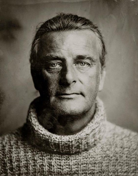
David Kremer ist Geschäftsführer der Kremer Pigmente GmbH & Co. KG. In zweiter Generation führt er das 1977 gegründete Familienunternehmen zusammen mit seinem Vater Dr. Georg Kremer. Zusammen sind sie ständig auf der Suche nach neuen Farbnuancen quer durch Europa. An mehr als 60 Fundstätten graben sie nach Erden und Mineralien.
Das familiengeführte, mittelständische Unternehmen hat sich auf die Herstellung und den Vertrieb seltener und historischer Pigmente spezialisiert. Die in der Farbmühle in Aichstetten im Allgäu beheimatete Firma ist Weltmarktführer im Bereich der Pigmente für die Denkmalpflege, Restaurierung und die anspruchsvolle Malerei. Durch die Entwicklung von Spezialprodukten bedient Kremer Pigmente weitere Nischenmärkte in diesem Bereich.
Das familiengeführte, mittelständische Unternehmen hat sich auf die Herstellung und den Vertrieb seltener und historischer Pigmente spezialisiert. Die in der Farbmühle in Aichstetten im Allgäu beheimatete Firma ist Weltmarktführer im Bereich der Pigmente für die Denkmalpflege, Restaurierung und die anspruchsvolle Malerei. Durch die Entwicklung von Spezialprodukten bedient Kremer Pigmente weitere Nischenmärkte in diesem Bereich.
Michael Bach
Biographie
Prof. Dr. Michael Bach ist Professor für Neurobiophysik am Universitäts- Augenklinikum Freiburg und leitet dort die Sektion Funktionelle Sehforschung, Elektrophysiologie. Er ist Präsident der International Society for Clinical Electrophysiology of Vision (ISCEV) und Schriftführer des Kunstvereins Gundelfingen. Zu seinen Forschungsschwerpunkten gehören das Sehsystem des Menschen und elektrophysiologische Diagnostik von Augenerkrankungen. Er erhielt 2006 den Elfriede-Aulhorn-Preis für seine Forschungen im Bereich der Physiologie und Pathophysiologie des Sehens sowie der Neuroophthalmologie.
Bevil Conway
Biographie
Bevil Conway is Professor of Neuroscience at Wellesley College in the United States.
He is a visual neuroscientist and artist who studies the neural basis of color using physiological, behavioral, and modeling techniques. His laboratory uses a range of techniques, including fMRI-guided microelectrode recording and microstimulation in awake-behaving non-human primates trained to perform visual tasks, along with psychophysics and fMRI in humans, and computational modeling, to define and test hypotheses relating physiology and perception. In addition to maintaining an active studio practice, Prof. Conway is involved in ongoing projects at the interface of visual neuroscience, visual art, and the practice of making art. He teaches core courses in the Neuroscience program and an advanced interdisciplinary laboratory course, Vision and Art: Physics, Physiology, Perception, and Practice.
His artwork has been published in several books including Vision and Art (Abrams, 2002) and Brain and Visual Perception (Oxford University Press, 2004), and has been used by BOSE Wave Radio in advertising. A major solo show of his work, 'FACTS', took place at the Radcliffe Institute for Advanced Study in 2010/2011. The work is held in several private collections in Europe, Africa and North America and is in the public collection of the Fogg Museum and the Boston Public Library, and on semi-permanent exhibit at the N.I.H. He is currently working on a series of drawings and etchings, a 'Rake's Progress', exploring mark-making and movement, inspired by Mark Morris's Dancers.
Dr. Maria Olkkonen
Biographie
Dr. Maria Olkkonen works as a lecturer at the Department of Psychology at Durham University in the UK, and as an Academy research fellow at the University of Helsinki in Finland.
She received an M.A. in psychology from the University of Helsinki in 2004, writing her master's thesis on the interaction between brightness and color information in the simultaneous contrast illusion. Working with Dr. Pentti Laurinen on her master's thesis instilled in her an excitement about using psychophysics as a rirogous tool to study psychological processes and neural computation. After working in corporate research for a while at the Nokia Research Center, she decided to go back to academia and was offered a PhD studentship with Prof. Karl Gegenfurtner at the University of Giessen where she received her PhD in 2009. To learn more about color and material constancy, she then moved to Philadelphia to work with Prof. David Brainard at UPenn. While in Philadelphia, she also worked with Prof. Sarah Allred at Rutgers on the relationship between color memory and perception, and finally did a two-year project in Prof. Russell Epstein's lab learning about fMRI adaptation and MVPA methods. She has been in Durham since September 2015.
She received an M.A. in psychology from the University of Helsinki in 2004, writing her master's thesis on the interaction between brightness and color information in the simultaneous contrast illusion. Working with Dr. Pentti Laurinen on her master's thesis instilled in her an excitement about using psychophysics as a rirogous tool to study psychological processes and neural computation. After working in corporate research for a while at the Nokia Research Center, she decided to go back to academia and was offered a PhD studentship with Prof. Karl Gegenfurtner at the University of Giessen where she received her PhD in 2009. To learn more about color and material constancy, she then moved to Philadelphia to work with Prof. David Brainard at UPenn. While in Philadelphia, she also worked with Prof. Sarah Allred at Rutgers on the relationship between color memory and perception, and finally did a two-year project in Prof. Russell Epstein's lab learning about fMRI adaptation and MVPA methods. She has been in Durham since September 2015.
Prof. Anya Hurlbert, Ph.D.
Biographie

Anya Hurlbert is a Professor of Visual Neuroscience at the Newcastle University in the UK.
Her background is in physics, medicine and neuroscience, with her higher education and early career research experience taking place on both sides of the Atlantic. She graduated from Princeton University in 1980 with a BA in Physics, followed in 1981 by a Part III Diploma in Theoretical Physics and in 1982 an MA in Physiology from Cambridge University, where she held a Marshall Scholarship. In 1989, she received a PhD in Brain and Cognitive Sciences from MIT, where she studied with Tomaso Poggio and Peter Schiller, and in 1990, an MD from Harvard Medical School. She then held a Vision Research Fellowship at Oxford University in Andrew Parker’s lab, before joining Physiological Sciences in the Faculty of Medical Sciences at Newcastle University in 1991 as a lecturer.
Her background is in physics, medicine and neuroscience, with her higher education and early career research experience taking place on both sides of the Atlantic. She graduated from Princeton University in 1980 with a BA in Physics, followed in 1981 by a Part III Diploma in Theoretical Physics and in 1982 an MA in Physiology from Cambridge University, where she held a Marshall Scholarship. In 1989, she received a PhD in Brain and Cognitive Sciences from MIT, where she studied with Tomaso Poggio and Peter Schiller, and in 1990, an MD from Harvard Medical School. She then held a Vision Research Fellowship at Oxford University in Andrew Parker’s lab, before joining Physiological Sciences in the Faculty of Medical Sciences at Newcastle University in 1991 as a lecturer.
Having moved from Physiological Sciences to Psychology, she became acting Head of the Division of Psychology, Brain and Behaviour (Faculty of Science, Agriculture and Engineering) in 2003, and interim Head in 2007, helping to create the new School of Psychology in the Faculty of Medical Sciences. In 2004, she co-founded the Institute of Neuroscience with the late Professor Colin Ingram, and was co-Director of the Institute until 2014. In 2012, they established the Centre for Translational Systems Neuroscience with a Capital Award from the Wellcome Trust.
Prof. Karl Gegenfurtner
Biographie
Karl Gegenfurtner studied Psychology at Regensburg University. Subsequently he obtained a Ph.D. degree from New York University, where he also spent his first PostDoc. In 1993 he moved to the Max-Planck-Institute for biological cybernetics in Tübingen, where he obtained his Habilitation in 1998 and a Heisenberg-Fellowship in the same year. In 2000 he moved to the University of Magdeburg and in 2001 to Giessen University, where he since then holds a full professorship for Psychology. The emphasis of Karl Gegenfurtner’s research is on information processing in the visual system. Specifically, he is concerned with the relationship between low level sensory processes, higher level visual cognition, and sensorimotor integration.
Karl Gegenfurtner is the head of the DFG Collaborative Research Center TRR 135 on the “Cardinal mechanisms of perception”. He was elected into the National Academy of Science Leopoldina in 2015.
Karl Gegenfurtner is the head of the DFG Collaborative Research Center TRR 135 on the “Cardinal mechanisms of perception”. He was elected into the National Academy of Science Leopoldina in 2015.
Thomas Euler
Biographie
Thomas Euler studied Biology at the University of Mainz, where he obtained a PhD degree (Dr. rer. nat.) in 1996. He conducted both his diploma and PhD work at the Max-Planck Institute for Brain Research in Frankfurt/Main. In 1997 he went to Boston, MA, for his first postdoc at the Massachusetts General Hospital and the Harvard Medical School. In 2000, he moved back to Germany and started as a project leader at the Department of Biomedical Optics of the Max-Planck Institute for Medical Research in Heidelberg. In 2006, he became a research group leader at the Department of Biomedical Optics. Between 2007 and 2009, he was offered professorships in Erlangen and Heidelberg, before moving to the Centre for Integrative Neuroscience of the University of Tübingen, where he since holds a full professorship for Ophthalmic Research at the Centre for Ophthalmology. Since 2015, he is coordinating the EC-funded training network “ITN switchBoard”.
Thomas Euler’s research focus is the functional organization of retinal microcircuits, aimed at a better understanding of the underlying computational principles. Furthermore, he is interested in how microcircuits change during retinal degeneration.
Thomas Euler’s research focus is the functional organization of retinal microcircuits, aimed at a better understanding of the underlying computational principles. Furthermore, he is interested in how microcircuits change during retinal degeneration.
Axel Venn
Biographie
Der Farbexperte, Künstler und Designer flaniert zwischen den Welten von Wahrnehmung, Wirkung und Realität. Seine farbforscherischen Arbeiten zielen auf die Entschlüsselung semantisch-semiotischer Botschaften. Ein Großteil seiner Tätigkeit widmet er dem wissenschaftsfundierten, strategischen Trendscouting und den Auswirkungen auf die Gesellschaft, die Ökonomie und das Design. Seit Jahrzehnten ist er Vortragsgast in Deutschland und rund um die Welt. Axel Venn ist em. Professor für Farbgestaltung an der Hochschule für angewandte Wissenschaft und Kunst, Hildesheim und ein Ehrenvorsitzender des Deutschen Farbenzentrums e.V.. Seine 25 Bücher über Farbe und Gestaltung sind bisher in 12 Sprachen übersetzt. Er lebt und arbeitet in Berlin.
Daniel Samanns
Biographie
Geboren 1968 in Düsseldorf, macht Daniel Samanns seine ersten photographischen Erfahrungen im Bereich Mode, Werbung und Still-life. Anfang der Neunziger noch ganz analog, ab 1997 dann völlig digital. Nach der bunten Welt der Werbung wechselt er in den Journalismus. Von 1996 bis 2000 ist er Photograph beim Axel-Springer-Verlag. Zunaechst in Düsseldorf, dann in München. Bei der ddp-Nachrichtenagentur arbeitet er seit dem Jahr 2000. Als Gründungsmitglied der erfolgreichen Münchner Photogalerie Pantarhei kuratiert und organisiert er von 1999 bis 2002 vielbeachtete Ausstellungen. Von 2002 bis 2007 ist er freier Photojournalist bei Focus Magazin, während er zusaetzlich Ressort übergreifende Auftragsarbeiten und Reportagen für Magazine und Illustrierte ausführt. Nach einem Jahr Bildberichterstattung mit Auslandsreportagen in Südost-Asien, landet er 2008 in Berlin, wo er als Photo- und Video-Journalist arbeitet. Seine Leidenschaft für die Kollodium-Nassplatten-Photographie (Wet-Plate-Process) lässt ihn seit 2011 nicht mehr los.
Um das kulturelle photographische Erbe am Leben zu erhalten, ist Daniel Samanns seit 2013 als freier Dozent taetig.
Das Interesse an Samanns´ kuenstlerischer Arbeit waechst ebenso . Ausstellungs-Anfragen, Portrait- und Spezial-Auftraege mit dieser Technik mehren sich seither.
Um das kulturelle photographische Erbe am Leben zu erhalten, ist Daniel Samanns seit 2013 als freier Dozent taetig.
Das Interesse an Samanns´ kuenstlerischer Arbeit waechst ebenso . Ausstellungs-Anfragen, Portrait- und Spezial-Auftraege mit dieser Technik mehren sich seither.